|
|
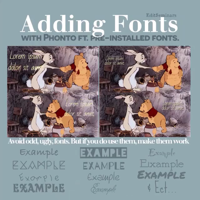
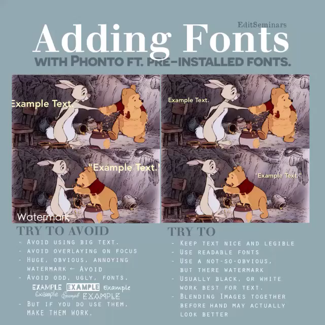
WHILE WORKING WITH FONTS TRY TO AVOID: |
WHILE WORKING WITH FONTS TRY TO: |
|
Avoid using [unnecessary] big text.
Avoid overlying font on the focus point of the edit. Avoid huge, obvious, annoying watermark. Avoid odd, ugly, unreadable fonts, but if you ever do use them make them work. |
Try to keep text nice and legible.
Try to use readable fonts. Try to use a not so obvious, but there watermark. Try to use a black or white color for the font or any font color that will work for the edit. |
** For scene edits, blending images together before hand may actually make your scene edit look a little better. [PicsArt, PicMix Lite, Superimpose, or Leonardo are good blending apps.]


DaFont.com is a website that allows you to download free fonts for personal use. Fonts you can load onto Phonto.

Phonto is an app that allows you to add text to your edits or images. It comes with pre-loaded fonts, and also allows you to load fonts from outside sources.
|
STEPS (WITH IMAGES):
|
INSTAGRAM POST: |
INSTAGRAM: @EDITSEMINARS |

 RSS Feed
